


The use of crowns in logos is a common practice among businesses and organizations to symbolize authority, power, and prestige. Whether it’s a fashion brand, a hotel chain, or a sports team, the addition of a crown can instantly elevate a logo’s appearance and make it more memorable. In this article, we’ll take a closer look at some of the best logos with crowns and explore why they work so well.
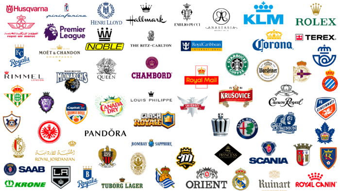
The power of a crown in a logo design is hard to deny. It can make a brand feel regal, authoritative, and prestigious, instantly communicating a sense of luxury and sophistication. But it’s not just about the imagery – a crown can also be a great way to tie together the different elements of a logo, creating a cohesive and memorable design.
In this article, we’ll explore some of the 10 best logos with crowns from a variety of industries and examine how they use this iconic symbol to strengthen their brand identity. We’ll also take a closer look at the different design elements that make these logos stand out and discuss how you can apply these principles to your own logo design.
10 Best Logos with Crowns
1. Starbucks

Starbucks logo features a mermaid with a crown, which is believed to symbolize the queen of the underwater realm. The brand is named after a character in Melville’s Moby-Dick, although there is no connection to mermaids in the story. The crown was added to make it clearer that the logo represents a mermaid, and not a woman doing a yoga pose. The logo has undergone redesigns by Terry Heckler in 1987, 1992, and 2011, but the mermaid with a crown remains a distinctive and recognizable element of the Starbucks brand.
2. Rolex
![]()
The crown logo of Rolex, a luxury watchmaker, is fitting for a brand associated with achievement. The logo, designed by Hans Wilsdorf and Alfred Davis, originally featured a black crown and was later updated with a gold crown and green typeface in 2003 to emphasize luxury. The abstract crown design, with its exaggerated height and five points, is said to represent the hand’s five fingers, adding to the brand’s sophistication and elegance. Despite lacking royal connections, the crown logo feels appropriate for Rolex’s brand identity.
3. Rimmel
![]()
With its origin rooted in London, Rimmel London draws inspiration from the land of its birth. Since its inception in 1834 during King William IV’s reign, Rimmel London has been an integral part of the cosmetics industry. The brand’s logo incorporates the British crown, which emphasizes its regal nature.
4. Royal Mail
![]()
The Royal Mail logo has been around for a while, with the current design being created in 1989, but it was closely modeled after a previous version from 1974. Despite the trend towards flat design, Royal Mail has opted to stick with an intricate, realistic illustration of a crown with gradient shadows. The crown design is based on the 13th-century crown of St. Edwards, adding a touch of tradition and reliability to the logo. The logo’s red colour palette also reflects the company’s iconic red post boxes. In comparison to the more abstract logo used by Spain’s post office, the Royal Mail logo stands out for its detailed design.
5. Hallmark
![]()
Hallmark, the greetings cards and television company, has been using its crown logo since 1952 with only minor modifications. The design is a perfect example of simple elegance, with a calligraphy font and monochrome application that exudes sophistication and class. The logo’s design makes it feel like a seal, which is fitting for use on greeting cards and envelopes. Additionally, the script style of the logotype matches the crown, creating a handcrafted aesthetic.
6. Royal Canin
![]()
Although Royal Canin has no royal lineage, its name and logo still exude a regal air. The pet food brand was founded by a French vet named Jean Cathary in the late 1960s, with an aim to serve mainly breeders. Its earlier logo featured a highly elaborate illustration of a crown on a ribbon with gothic text, which suited its lofty aspirations. However, in the mid-1980s, the company opted for a more streamlined design, which is still in use today. The brand’s connection with elitist traditions is reflected in its name, and the crown logo emphasizes the company’s commitment to providing high-quality pet food. Currently, Royal Canin is owned by Mars.
7. Canada Dry
![]()
Canada Dry, a popular beverage brand, has a logo featuring a crown that is a result of its connection to the royal family. Interestingly, the brand’s original logo was quite different from its current one. The original logo showcased a beaver over a map of Canada, highlighting the country’s wildlife and geography. However, this design did not last long as the brand was appointed to the Viceregal Household of Canada’s Governor General in 1907. As a result, the logo underwent a significant transformation to reflect this prestigious honor. The beaver was replaced with a more regal emblem, featuring a crown that symbolized the connection to the royal family. Since then, the crown has become a central part of the Canada Dry logo and is recognized worldwide.
8. Alfa Romeo
![]()
The Alfa Romeo logo has gone through nine iterations since its inception in 1910, with the crown becoming less prominent in the more recent designs. However, what many people might not have noticed is the image of a man being devoured by a snake in the logo. This design is a nod to the brand’s Milanese origins, with the flag of Milan and its coat of arms featuring prominently in the logo. The biscione, a snake eating a man, is a traditional heraldic symbol associated with the Visconti family, which ruled Milan in the medieval era, and is also used by many other companies from the city.
9. Moët & Chandon Champagne
![]()
While some brands use crown logos to signify their authentic connection to royalty, for others, it’s a matter of patronage. The original logo design of champagne maker Claude Moët was inspired by the crown of its early patron, Louis XV. Although the logo was updated in 2006, it made perfect sense to retain the symbol, which communicates the brand’s luxurious history and status. The logo’s elegant capital letters in a serif font further emphasize its sophistication.
10. KLM
![]()
KLM, an airline based in the Netherlands and part of Air France-KLM, has maintained its connection to the Dutch monarchy, which awarded it the title “Royal” in 1919. The company’s logo features a crown and was designed by British designer Henri Kay Henrion in 1964. It was last updated in 1991 to a simpler, one-color design (00A1DE), making it more adaptable for various uses. The designers’ foresight in choosing a single color was practical, according to KLM, as it makes the logo more usable for future designers and painters.
Conclusion
In conclusion, crowns are a powerful symbol that can convey a sense of authority, excellence, and prestige in a company or organization’s logo. The 10 logos we’ve looked at here are great examples of how crowns can be used effectively to create a strong and memorable brand image.


