

The year 2021 started with a few brands redesigning their logo. Some popular names include Burger King, Pfizer, and even KIA Motors. But not everyone gets it right on the first attempt. While some users loved and hated the redesigns, here are a few logo rebrandings from the past that have been loved and accepted by all users by far,
MasterCard
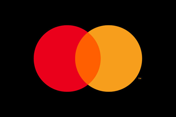
There have been two redesigns for Mastercard. Pentagram took over the job in 2016 showing the brand in two decades. Replacing the stripes in the old logo with solid-colored blocks, helped make the logo look more recognizable and modern. Also if you notice, Mastercard isn’t recognized by the name beneath the logo. This bold move was accepted by both them and Pentagram making the world realize what the brand stands for just by seeing the image.
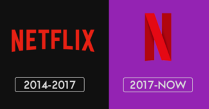
Netflix
![]()
Netflix started off in 1997 by selling DVDs on a rental basis. They would show you some of the most popular soap operas and films of that time through their rental programs. It was in 2014 when they got accepted as a growing OTT platform and converted their DVD sales into accessible streaming options instead. They removed the drop shadow from the letters giving them a contemporary feel as opposed to the old-school design that they had going on for a decade or so. The redesign was done by Moving Brands who brought the color red in the front design.
Burberry
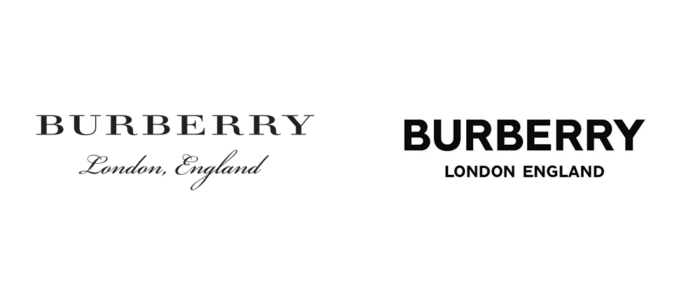
Burberry got designer Peter Saville to recreate their logo from scratch. This pairing worked in favor of the brand. He has also designed the logo for Calvin Klein and is popular for using San Serifs and all-caps. Well, that did the magic for Burberry too didn’t it?
Juventus
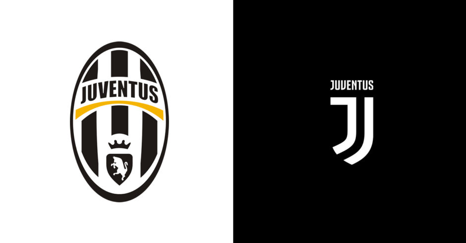
Juventus, the popular football club spanning over 120 years has a bold reimaging sought out by Interbrand. By making Juventus appear for what it always has stood for, the logo encompasses the stripes of the jersey, the shield, and the players. Juventus is the most popular Italian football club. While many fans do not agree with the new logo, we believe that this actually makes Juventus look like a leader in what is best.
Coors Light
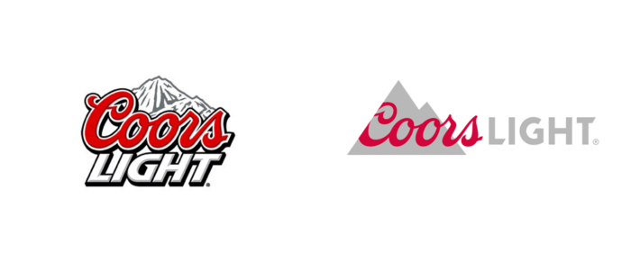
One of the most popular craft beer brands has been Coors Light. So in 2016, the brand decided not to stay too far behind by rebranding its logo. Turner Duckworth was the brains behind this fresh take which showed the world how Coors takes its booze seriously. The new logo and tagline make the brand look stylish and show its story of how it was created.
Do you agree that these logos look much better now?
Source: Creative Bloq