

Logo design is one of the most important aspects of carving a brand’s identity and every brand wants a unique individualistic identity for its own. But there are a few big names that chose to copy others and be content and happy with a very similar kind of logo design. Let us take a look at some of the biggies who have almost identical logos
Chanel and Gucci
Chanel has existed as a design company since 1909, whereas Gucci was founded in 1921. Although Gucci’s logo is seen more frequently as GUCCI written across fully, who can deny the resemblance between the logo symbols wherein Chanel has used two Cs in opposite and Gucci used two Gs.
![]()
![]()
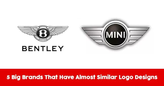
Bentley and Mini Cooper
Coincidentally, this happened yet again in the companies that belong to the same industry. The use of silver wings with just a difference of more detail in Bentley’s logo as compared to Mini Cooper and even similar kind of text, makes these two automobile giants have almost identical logos. Again, Mini Cooper could be blamed for the same, as the company launched 40 years after Bentley.
![]()

Auto Trader and Pepsi
They are neither in the same shape and nor from the same industry, but the color scheme that is 100% identical and the line in the middle proves how much Auto Traders tried to copy or get inspired from this Pepsi logo.
![]()

Sun Microsystems and Columbia Sportswear
The same diamond shape pattern and the dynamics of using the same writing style for header and subtitle make these logos very identical. Although the companies belong to a completely different business industry, it is bizarre how similar the logos look.
![]()
![]()
Carrier and Ford
Same white text in Italics enclosed in a blue oval and surrounded by a white outline, what more is there is the logo that is not same. Though the Ford logo has a slightly more elite look and feel, the resemblance is way too much.
![]()
![]()
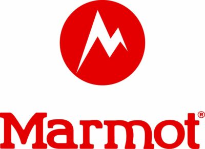
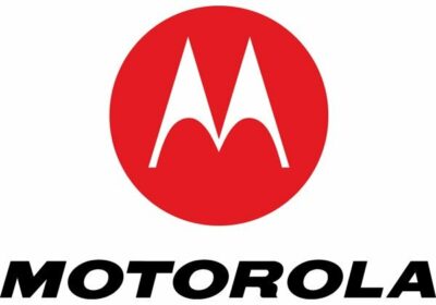
Motorola and Marmot
The stylized M and the circles clearly make these logos very similar. Motorola here is the older company and has the first mover advantage, but the cleverness of Marmot is very evident.