It’s been just 12 days into the New Year and a number of individuals and companies have taken the ‘New Year, New Me’ quite seriously. From redefining their policies to improving their brand identity, these few brands have begun a fresh start right by changing their age-old logos. It has come as a fruitful surprise for a lot of customers, whereas some others have totally disapproved of the same.
Kia
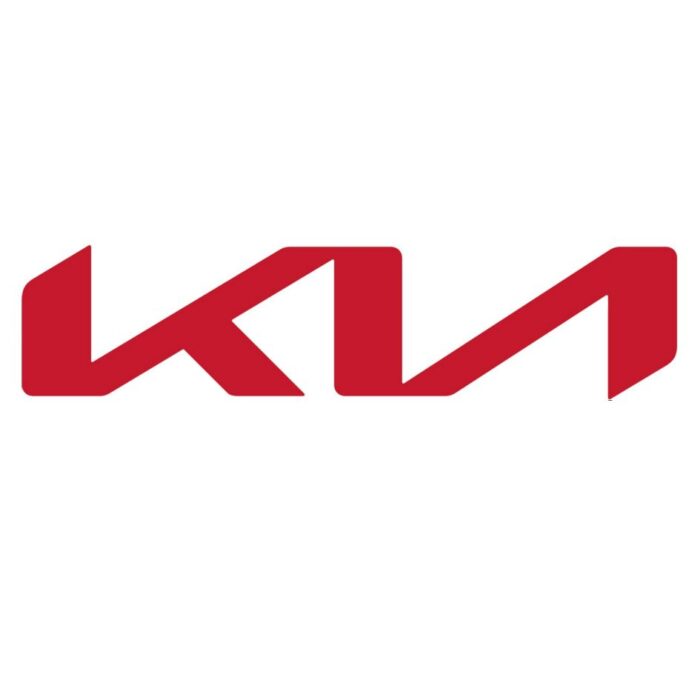
Kia Motors has adopted a handwritten format of its previous one. This is more angular in nature and its revelation was done through drone-based fireworks sometime ago last year. By using these rhythmic, unbroken lines, Kia is trying to convey its brilliance in serving customers for decades. The gestures signify the brand’s willingness to aim higher to satiate their customers’ ever-growing needs.
General Motors
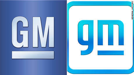
Most consumers have called out the new logo of GM Motors as a major fail this season. The old GM’s blues are drawn into a box. The company declared that they want the blue to hint at the clear skies that were free from emissions. There’s also an underline below the ‘m’ that make it look like an electrical plus. In addition to this, the round edges of the fonts make it appear more modernistic than ever.
Pfizer
In order to realize the breakthroughs of the future, we’ve revolutionized how we work today. We're unlocking the pill to reveal Pfizer’s DNA: the power of science. pic.twitter.com/NO0TWt6OVh
— Pfizer Inc. (@pfizer) January 5, 2021
Pfizer was highly talked about last year because of its invention of a vaccine for coronavirus. Since then, the company decided to take a new leap in reinventing their brand logo. It features a double helix spiral indicating a DNA loop rather than the pill-shaped outline from before. The company insists on becoming a brand that focuses on eliminating diseases rather than being a commercial healthcare identity.
Burger King
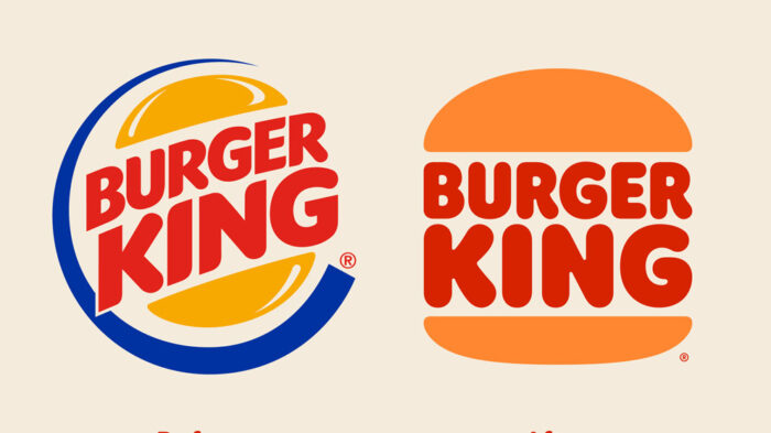
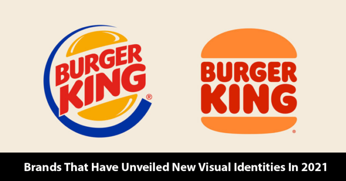
Burger King has made their logo brand new with a modern twist. By achieving flame-grilling perfection, they have also adopted their new identity in their uniforms. It is a playful illustration in the form of a suitcase full of food, as indicated by the two buns of a burger and ‘BURGER KING’ written in between. Some even consider it to be the return of their old logo that was used between 1994 to 1999.
Baskin Robbins
Basking Robbins came out with a few holiday-themed designs showing its 31 flavours. This really picked the interest of its consumers who saw a cute and fun avatar for all the different flavours.


