

The benefits of rebranding are many- getting a new corporate identity, appealing to and inviting new audiences, clients and talent, improving brand awareness, etc. the list runs long.
In 2022, many brands underwent this process, with many others updating their logo, and consequently their brand system. Here is a listing of 5 such standout brands.
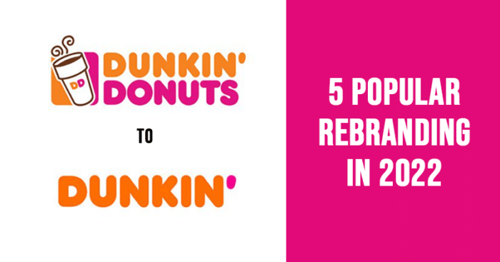
1. Dunkin Donuts to Dunkin’
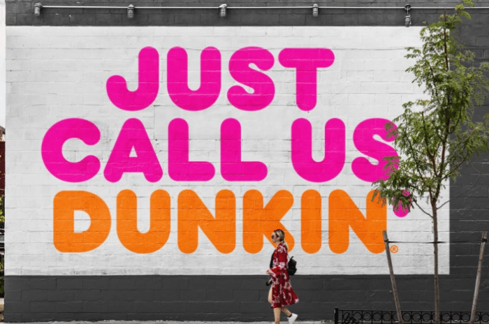
While many Americans are familiar with Dunkin as the name for the donut chain since its tagline has been- America Runs on Dunkin, the company recently dropped using ‘Donuts’ from its name officially.
Though the brand has changed its logo before too, dropping half of the brand name, seems a big move.
However, apart from the name change, changes were made in areas like the logo, packaging and store remodeling, and brand messaging too.
2. Sprite
![]()
This year, Coca-Cola announced a global rebranding campaign for its lemon-lime beverage Sprite, in order to connect with strength and youthfulness to appeal to Gen Z consumers.
Through their campaign titled ‘Heat Happens’, Sprite believes that the Gen-Z today are living in a heated environment, where even a small incident may turn into a heated argument. However, this does not just translate to the heat that builds up on any fight or argument, but also the physical heat, which Sprite has always been known to quench.
Their signature yellow and green colors were retained. The starburst around the name has been left out, moving the name near the bottle cap and also showcasing the flavors.
3. Toblerone
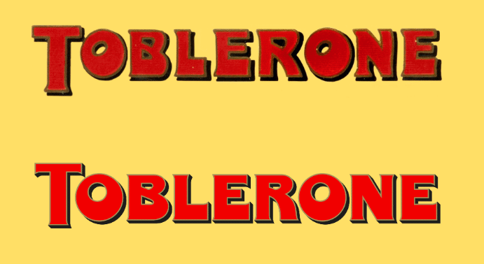
Bulletproof studio rebranded Toblerone chocolate earlier this year, and the world’s well-loved chocolate has a new colorful identity and font.
Believed to be in urgent need of modernization, the new branding has a more colorful palette, but with its iconic chamois, red, black and gold used too. This has the brand adopt newer elements keeping in mind its rich past.
4. Indeed
Indeed, didn’t change or redo their logo. They kept it the way it is, but still achieved much more.
The logo of the company is simple, memorable, and unique. And creating a new look for themselves wouldn’t have been a profitable exercise. But doing so, only made the brand versatile, dynamic, and attractive, raising its recall value by leaps and bounds.
They upgraded their website and brand system to make it more appealing and contemporary.
5. Baskin Robbins
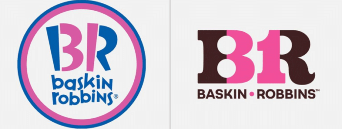
Their new retro logo comes after its iconic one. The new one uses brown and pink, just like it did when the brand started out.
Based on the adage- to grow up a little, one needs to get young, this massively popular chain of ice creams used the number 31 indicating the number of flavors to be enjoyed in a month.
Talk about being in touch with your roots, no matter how high your soar. Another lesson learned is the importance of color in designing a logo since it has a huge influence on one’s mood.
Change in logos
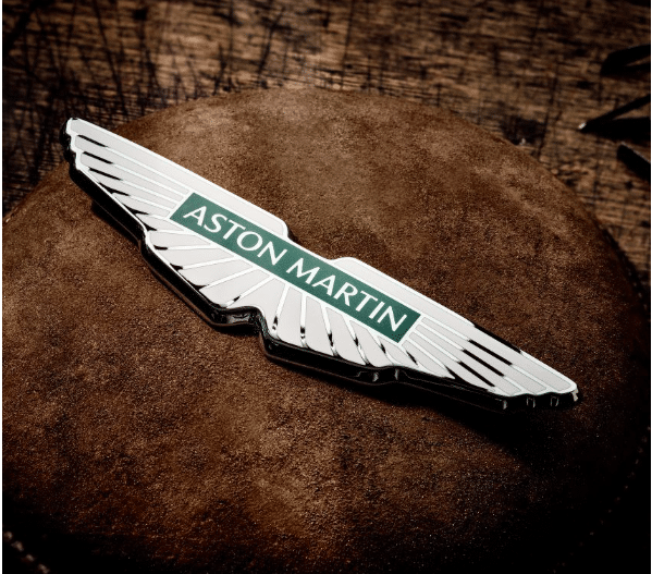
Many other brands incorporated changes in their logos this year. Notable ones amongst them were car manufacturers like Aston Martin, Audi, Citroen, Skoda, Bugatti, and Rolls Royce, Pharma company GSK, tech brands Zapier and Hootsuite, and the very popular Instagram.