

Building a brand identity especially with its logo is a huge task and most brand agencies take this very seriously. When brands decide to opt for rebranding, it’s a tougher challenge for agencies, because they have to retain something that creates a recall and yet change it. Not every time, every agency is successful in doing so. Let us take a look at some of the biggest rebranding failures and also see the costs involved in doing so.
GAP
During the 2010 Christmas period, Gap launched its new logo without creating any pre-buzz about the same. The original logo had been their identity for over 20 years and yet without a warning, the same was replaced. The new logo had the word Gap in a bold font and a square, fading diagonally from light blue to dark blue. Slowly the common people, as well as the design community, started reacting to the logo and it became evident that it did not receive any positive reviews.
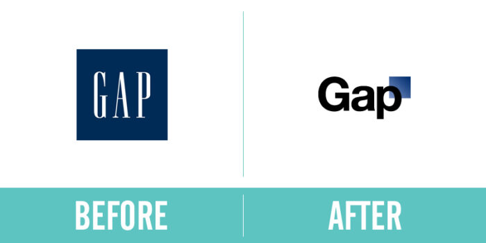
Gap responded positively, revealing that their new logo design was, in fact, the first stage of a crowdsourcing process that allowed them to reinvent the company. This followed by Gap performing possibly one of the fastest branding turnarounds of all time when they reverted to their original design, just six days after putting their new logo out into the public.
The Gap rebrand was estimated to have cost them $100 million for what people regarded as a WordArt blunder.
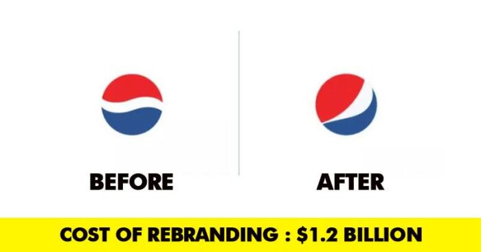
Pepsi
Unlike rival brand Coca-Cola, Pepsi has always struggled with its brand identity. They have changed their logo multiple times. In 2008, Pepsi released the latest iteration of its logo, rotating the circular icon and incorporating a “cheeky smile” into the design. The smile was invariably invisible to most people.
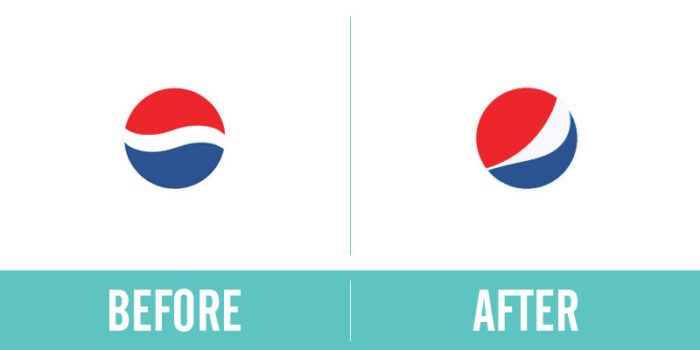
“The white stripe on the new logo varies across Pepsi products, getting wider or thinner depending on the product. The design team that spearheaded the campaign explains that they’re supposed to be “smiles,” but we don’t really see it.” – Forbes Magazine
The cost of rebranding the entire Pepsi company is said to be $1.2 billion over 3 years with the logo mark for Pepsi alone coming in at $1 million.
Royal Mail
Royal Mail (the UK’s biggest mail carrier) announced a new company name and brand: Consignia in January 2001. Most people did not even understand the meaning of the new brand name and the design definitely did not appeal to anyone. Mike Verdin of BBC News called the new name “A duffer. A howling waste of money.”
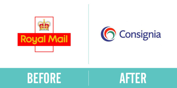
Living with the name for one year, the company reverted back to Royal Mail and mostly everything was forgiven and forgotten about Consignia. The Consignia name cost £1.5 million to launch in January 2001. A little over a year later, it cost the company £1 million to rebrand themselves again as Royal Mail.
Holiday Inn
When a company rebrands, one generally expects the new image to be fresh looking and forward thinking; however, both these things seemed missing in Holiday Inn’s new logo.

It did not seem very different in terms of color scheme and design from the previous one and neither did it showcase any futuristic approach. Considering the fact that the new logo is just 5 years old, it already seems dated. The design is said to have been developed by an in-house team and yet the cost is estimated to be around $1 billion which is too much money for such a generic solution.
Cardiff
The Premier League football team once known as the Bluebirds always had blue kits and a blue logo. When Mr. Tan, the new owner took over, he decided to bring about a major change to the logo and change the kit from blue to red, along with replacing the bluebird on the logo to a red dragon. The confusion lies in the fact that the team is still called by their nickname bluebirds and to substantiate that Tan even added a small bluebird in the predominantly red logo.
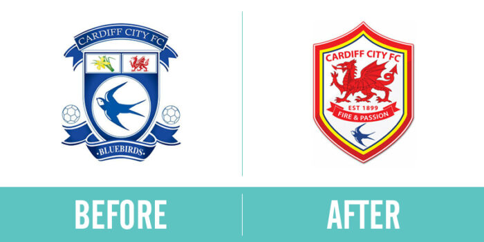
Vincent Tan had to shell out an estimated £100 million into the football team’s rebrand. Along with the monetary cost, the rebrand also cost Cardiff City the faith and trust of a selection of their newly confused fans.