


Every marketing enthusiast is usually aware of the importance of a brand logo when it comes to the visibility and branding of the company. Moreover, most customers remember the logo and connect with it first, allowing the brand to create a long-term impact.
However, many brands have gone one step ahead with respect to establishing a memorable logo. They’ve foregone their brand name and completely relied on the logo design, let’s check some of the top names:
1) Apple
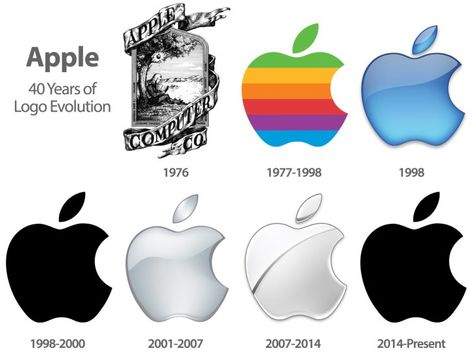
We all connect to the black half-eaten apple design that has been the eye-catcher on all Apple devices. Designed by Rob Janoff, it was earlier precedented by a vintage design of Isaac Newton as the centerpiece. However, in 1984, the new design took the lead and won for its minimalism.
2) Starbucks
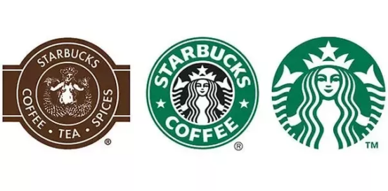
The renowned coffee chain earlier had a design inspired by a two-tailed mermaid at the centre and the brand name surrounding it. Called as Starbucks Siren, the centre design was changed multiple times but in the end, the brand name in the logo was eliminated in 2011 after Lippincott’s rebranding happened.
3) Shell
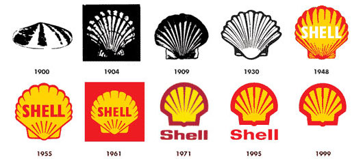
Shell is one of those companies that followed the path of a realistic logo that links it with the brand. The logo has always been a replica of the scallop shell, simply changing colours from an initial black-white to now a bright red-yellow shade.
4) McDonald’s
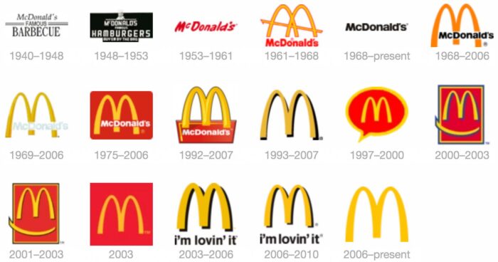
Mcdonald’s started with the Golden Arches logo in 1961. After 1961, there were many changes in the design, including overlying text, red backgrounds, and new taglines. However, it was only in 2006, McDonald’s decided to go solo and became memorable by a simple golden arch.
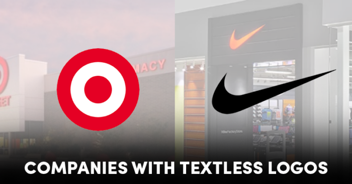
5) Target
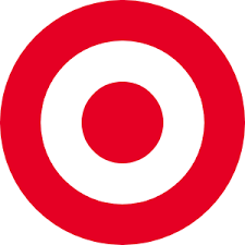
Target went brand nameless on its logo as early as in 1968, with the present day, the three-ringed red-white colored logo being made then. However, the brand name came back in 1975 and was responsible for reducing the actual logo’s size and impact. Hence, after much debate, back in 2007, the logo was back to basics, the ringed circle, and no brand name.
6) Nike
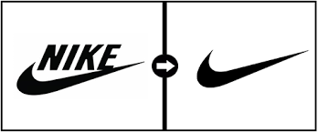
After being made in 1971 by designer Carolyn Davidson, the logo was a single black swoosh and ‘NIKE’ written in Futura Bold. However, in the 90s, only the swoosh was kept and has now been the sole representative of the brand. Nothing beats NIKE.