


Car logos occupy a special place in pop culture. We love the way they look and the ideas they represent. However, many of us tend to be wrong about the meanings behind classic auto emblems.
One of the most misunderstood car logos is BMW’s. The popular theory is that it portrays a spinning propeller, as shown in this infographic from Carsurance. But, in reality, the logo is simply an allusion to the flag colors of Bavaria, the German state home to the auto brand.
BMW is only one of the several iconic car badges that we see on the streets. Below are seven others that are just as – if not more – mysterious.
1. Audi
The interlocking rings of Audi symbolize the four German automakers that merged in 1932. They were Audi, DKW, Horch, and Wanderer, which are collectively known as the Auto Union.
Interestingly, only the group’s racing cars sported the quadruple ring logo while the vehicles of each member brand at the time used its own emblem.
2. Toyota
Any savvy Toyota salesperson will probably offer a heartwarming explanation for the three overlapping ovals in the brand’s logo. But what’s more interesting is that the letters “T,” “O,” “Y,” and “A” are hidden in the symbol, spelling out “Toyota” in a clever fashion.
3. Hyundai
The chances are that everyone can agree that the Hyundai logo is undeniably a stylized letter “H.” But, upon closer inspection, if you can make out two individuals shaking hands, you wouldn’t be imagining things.
The Korean automaker purposely designed its emblem in such a way to communicate a happy customer striking a deal with a Hyundai representative.
4. Ferrari

The black stallion in its insignia and the ultra-high horsepower of Ferraris are just a happy accident.
The famous prancing beast actually first soared the skies during World War I as painted on the fuselage of the bi-plane of legendary Italian pilot Francesco Barraca before blowing past all others in racetracks and on roads today.
The same equine figure – which is the heraldic device of Stuttgart – also inspired Porsche’s trademark.
5. Lamborghini
![]()
A Lambo is like a bull you can’t tame. So while the automaker’s symbol might seem fitting, its car logo actually signifies the Taurus, which was Ferruccio Lamborghini’s zodiac sign. The founder also chose the wide cattle as the company’s emblem, because he was an aficionado of bullfighting.
6. Alfa Romeo
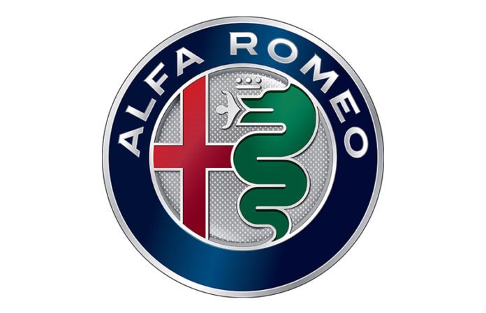
Alfa Romeo’s symbol of a snake eating a man is perhaps the most disturbing car logo design. But the meaning behind it isn’t as dark as many have been led to believe.
According to the automaker’s official statement, the emblem doesn’t show a person being swallowed by a serpent but a human coming out of a monster. In other words, the seemingly morbid image actually represents purification and renewal.
7. Tesla

Other than being the first letter of Tesla, the “T” in the brand’s logo was clarified to be a cross-section of an electric motor. In fact, CEO Elon Musk provided the explanation on Twitter.
Car logos are nothing more than just marketing elements meant to sell powerful ideas – and automobiles, ultimately. But when designed masterfully, such insignias become cultural treasures that are celebrated for generations. Check out the infographic to see if there are more to the badges of other automakers than meets the eye.
Guest Article by –
Karthik Reddy
Community Manager
Carsurance


