


Coca-Cola brought in a refreshing line this February, by aligning its Diet Coke and Coca-Cola designs. After its One Brand strategy in 2016, this is a new update that encourages the customers to try different varieties of Coca-Cola. You might have already come across a few of these. Here’s how refreshing the whole concept is, visually.
How has Coca-Cola elevated its design?
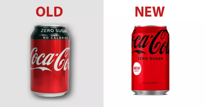
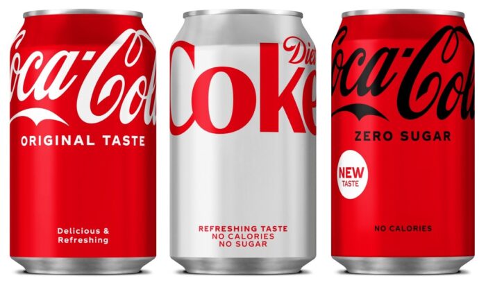
While maintaining the classic red across all variants, the brand logo can now be seen on top of the label. It is a rather simplified design that has been extended to its No Sugar line which will promote sales of the Diet Coke variants as well.
The No Sugar variant was launched five years ago and the brand now wants to accelerate its growth, especially in the UK. Even the Coca-Cola Zero Sugar variant will follow suit, after tweaking its taste to feel more like the original.
This revamp comes as a result of a logistical decision to promote the sales of this variant in the UK primarily and then shelling it out to the rest of the world. For the unveiling, the brand onboarded rapper Tyler the Creator. This comes after the brand’s revenue declined by 7% in 2020.
Are you in favor of the new Coca-Cola or prefer the old design? Let us know your thoughts in the comments.
Source: Marketing Week