


Symbols have meanings. And symbols do a lot for brands. Like for instance, make an impact, create a strong first impression, differentiate from competitors, foster brand loyalty etc… A lot of thought and research goes into making a logo. And each logo has a story behind to it. Let’s check out a few well-known brand logos with some interesting facts
1. Facebook
The brands iconic logo is the blue ‘f’, is thought to be of symbolizing connecting with Friends. But an interesting fact is that Founder Mark Zuckerberg is red-green colorblind and can see the color blue, which for him, is the richest color. That’s the reason behind the blue ‘f’
2.Amazon
We all know that Amazon’s logo shows a smile from A to Z, signifying that it is willing to deliver anything to anyone, everywhere in the world. But very few know that Jeff Bezos wanted the company to be named ‘Cadabra’ from the word ‘Abracadabra’
3.Nike
![]()
The iconic swoosh was designed by Carolyn Davidson, then a student at Portland University for just $35. And this logo came before the company’s name ‘Nike’
4.BMW
![]()
The company logo is a tribute to its Bavarian roots, with blue and white colors used to represent the flag of Bavaria. It also represents the spinning propeller of a plane, reminding of the fact that BMW were originally airplane engine manufacturers.
5.Adidas and Puma
The Dassler brothers did not want to join family business and hence started the Dassler brothers Shoe Factory. But due to a fight between the two, Adolf Dassler changed the name of the factory to Adidas and Rudolf Dassler founded Puma. Today, eight decades later too, both companies are doing well.
6.Baskin Robbins
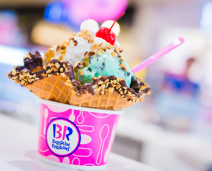
The logo of the brand has alphabets weaved with the number 31 seen in pink and blue color. It stands for the brands belief that their guests should have an opportunity to be served a new ice cream flavor every day of the month.
7.Apple
![]()
The logo that has been iconic for generations now, has a massive influence on audiences. The original logo designed by Ronald Wayne had Sir Isaac Newton sitting under the tree, the very spot that helped him talk research on gravity. But since it had to fit on smaller devices, the logo was re-designed many times over a substantial time period.
8. Disney
![]()
For the first 48 years after Disney was established, there was no log at all. The credits only read “ Walt Disney presents”. But then later on, the logo saw many makeovers and with the castle in the logo being inspired from the cult film ‘The Black Cauldron’. Now, the unique logo has a shooting star that arcs around the castle, symbolizing the message of wishes coming true.
9.Audi
The four rings that make up the Audi logo, represents the merger of four companies- Audi, Horch, DKW and Wanderer. Also, the name Audi is based on the Latin translation of the surname of founder August Horch. In German ‘Horch ‘means listen and in Latin it means ‘Audi’
10.Google
![]()
In 1997, Larry Page and Sergey Brin had named the company Googol, referring to specific large numbers. However, due to spelling mistake, the name got registered as Google. From 1999 to 2015, the logo had an exclamation mark, which was then removed as Wikipedia suggested that the mark was a deliberate attempt at copying Yahoo!
There are many interesting stories about other bands too. And just like the above, many have had makeovers after years of research and relevance to the times they operate in.