


Have you ever wondered why popular fast food chains use red and yellow colours on their hoardings and logos? There is a big psychology behind this. According to reports, customers make 60% of their decisions based on colour of the product alone and there are multiple reasons for using different colours.
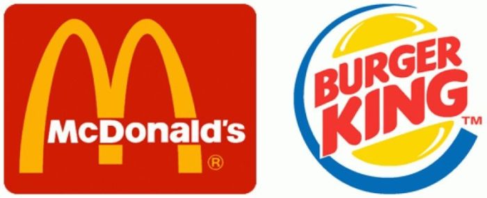
Think about the advertising panels and logos of McDonald’s, Burger King, KFC, Wendy’s, Pizza Hut. What do you find common among all these? One major similarity is the colour that they use. The science behind using these colours is called ketchup and mustard theory.

Also Read:Ever Wondered Why Beer Bottles Are Brown Or Green In Colour?
Scientists believe that both these colours have the ability to encourage viewers to eat. Also, colours are the fastest mode of communication for our brain. Yellow is a symbol of happiness, excitement, and cheer and red is an attention seeker causing triggers of appetite and hunger. Red makes us feel warm, loved and comfortable which is necessary for a good long meal. Yellow grabs our attention from a long distance and it also increases the speed of our metabolism.
Experts believe that combination of these 2 colours create the perfect combination of emotions and feelings to make people feel hungry and spend more time while having a meal.
Even if this theory is not 100 percent correct, companies do believe that there is something special about red and yellow which makes them use these colours. It is clear from the results that there is definitely a connection of colours in making us feel hungry. In the age of competing, brands use every possible tactic to attract customer and there is nothing bad about using the same colours if it effective for increasing sales.
Also Read: 10 Secret Tricks Advertisers Use To Make Food Look Delicious


