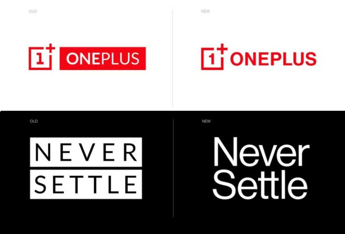
Popular smartphone brand OnePlus has officially unveiled its new logo today. While the company believes that the new visual identity is not far from the previous and only very few changes have been made. The biggest change we see is the number “1” which has been shifting to a curvilinear design.

The logo has a new font with all letters in Caps which look bolder than before. The red color exists but in some of the areas, OnePlus will use dark grey for the logo. The new logo is refreshing but it still relates to the original logo.
“OnePlus is not changing who we are, but reinforcing what we stand for – the true spirit of Never Settle,” said Mats Hakansson, Global Creative Director of OnePlus. “We always design for our users. We feel that these changes maintain the iconic elements of our brand that are beloved by our staff and our community while injecting both excitement and balance into our visual identity.”
Quote source: BusinessInsider
This is the first time the OnePlus has changed its brand identity. Apart from the new logo, the company is switching to a fresh color palette that includes cyan, green, magenta, indigo, and yellow. Probably this logo and brand identity will be seen soon on the rumoured OnePlus 8 series that’s expected to launch in next few months.


